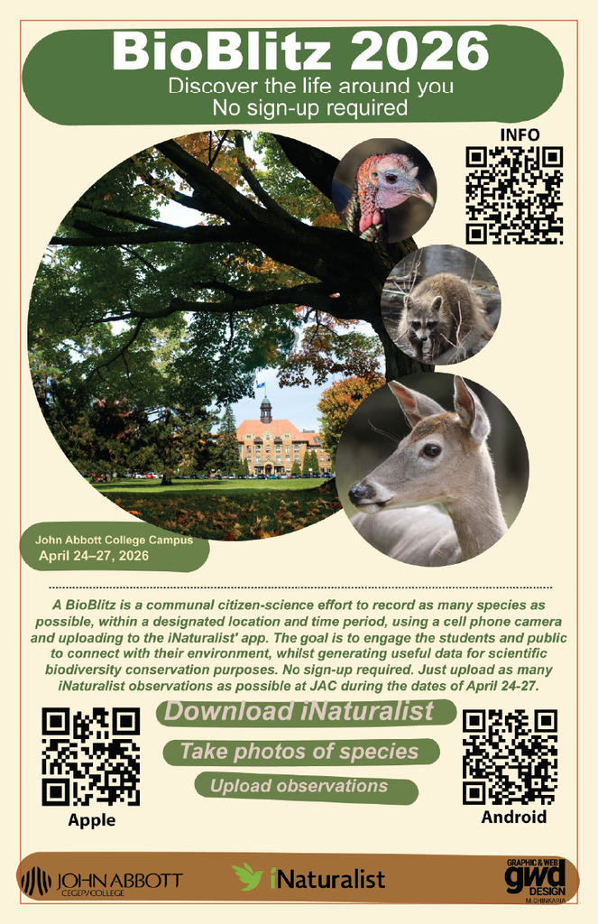
TThis BioBlitz graphic design project promotes the event and makes the information easy to understand. The main challenge was organizing the details without making the poster feel crowded. I used colours, images, and typography to create a clear visual hierarchy.
I wanted the poster to feel fun and connected to nature. The colours give the design an energetic look. The images add more personality and support the nature theme. I also used different type sizes to make the most important information stand out.
Another challenge was balancing the text with the visual elements. A poster needs to communicate information quickly. I organized the content into clear sections so viewers can find the details easily. The layout also gives each part of the poster enough space.
This piece belongs in my portfolio because it shows how I combine images, typography, colour, and layout. It also shows how I can organize a lot of information in a simple way. The project helped me create a poster that feels clear, engaging, and easy to follow.