Graphic Design Magazine Project
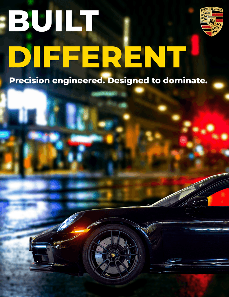
This graphic design magazine project was about creating a layout that feels clean, interesting, and easy to follow. I wanted the typography, images, and layout to work together without making the pages feel too crowded. The goal was to make the magazine look like a real publication while still adding my own style to it.
One of the main challenges was finding the right balance between the text and the images. There was a lot of information to fit onto the pages, so I had to be careful with the spacing and placement of each element. I used different type sizes and weights to make the important information stand out and make the pages easier to read.
The images were also an important part of the design. Instead of using them just to fill space, I placed them where they worked best with the content. I also kept the typography, spacing, and alignment consistent across the pages so the magazine would feel like one complete piece.
For this graphic design magazine project, I also wanted each page to have some variety without making the overall design feel random. Small changes in the layout helped keep the pages interesting while the repeated design elements kept everything connected.
I think this piece works well in my portfolio because it shows my skills with typography, photography, colour, and layout. It also shows that I can take a large amount of information and organize it into something that is easy to read and visually appealing. The project helped me get more comfortable with editorial design and making decisions about how different elements should work together on a page.