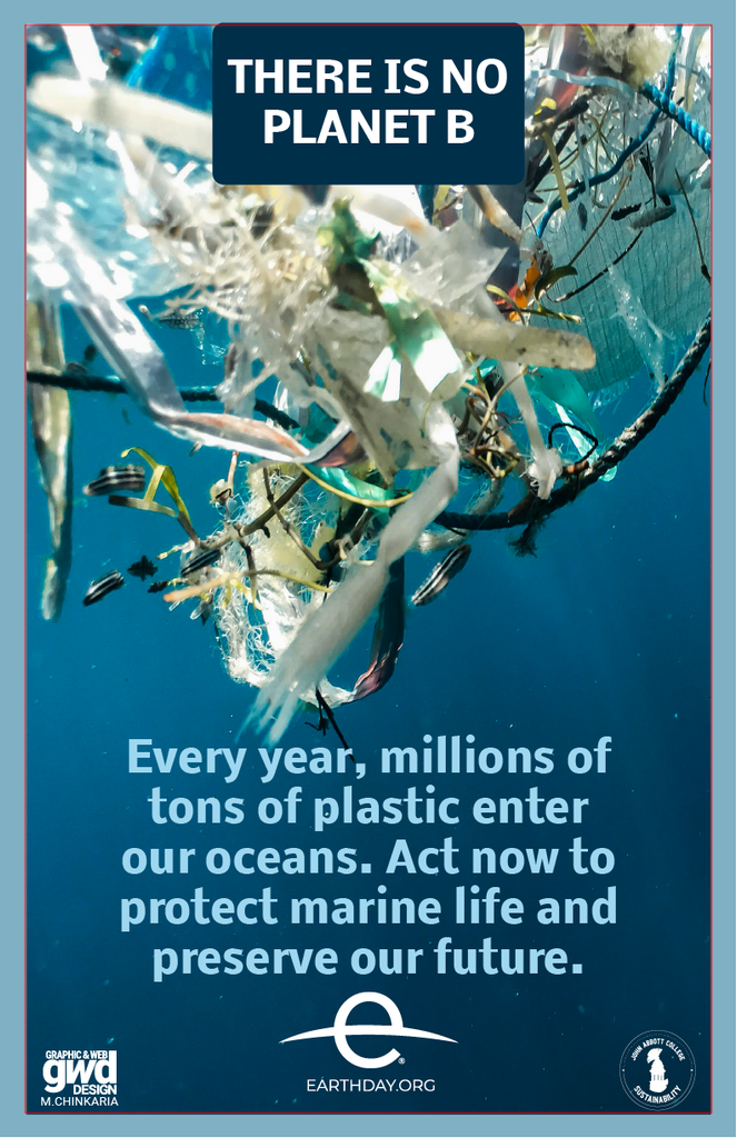
This Earth Day graphic design project brings attention to an environmental topic in a fresh and engaging way. The main challenge was organizing the information without making the layout feel crowded. I used bright colours, images, and typography to separate the sections and keep the design connected to the Earth Day theme.
I focused on creating a clear visual hierarchy throughout the page. Different type sizes help guide the viewer through the content. The images also break up the text and add more visual interest. The colour palette gives the page a bright and natural feeling.
Another challenge was balancing the amount of information with the visual elements. I used the grid to keep the content organized and create a consistent structure. This helped the page feel clean while still giving enough space to each section.
This piece belongs in my portfolio because it shows how I use layout, typography, colour, and imagery together. It also shows how I can organize a lot of information without making the design feel overwhelming. The project helped me create a page that feels informative, colourful, and easy to follow.