
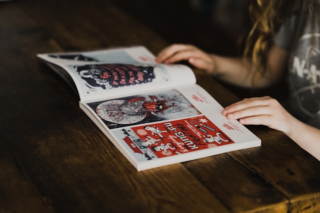
Do you ever look at a design and say to yourself, “This is serious,” or “This is fun,” or “This is professional”? Perhaps it’s the font. Typography is more than simply picking a font that looks good. Different fonts can create different feelings. Modern and confident sans-serif fonts can feel bold, while serif fonts can feel classic and professional. Round fonts can feel friendly, and handwritten fonts can feel personal. This is why typography in graphic design can completely change the mood of a design.
Choosing the Right Font in Graphic Design
Choose a font that fits the message and audience. A playful font may work for a children’s event but probably would not work for a serious business document. You can also pair two fonts to make contrast. For example, you can use Montserrat Bold for the headings and Lora Regular for the body. This helps establish a clear hierarchy and makes the design easier to follow. You can also explore different typefaces on Google Fonts to find one that fits your design.
Typography and Mood in Graphic Design
A font can be lovely, but if people can’t read it, then it isn’t really doing its job. Readability is influenced by font size, spacing, line height, and contrast. Good typography makes information easy to understand without distracting the reader.Good typography makes information easy to understand without distracting the reader. White space in graphic design can also help make typography easier to read and understand.
Typography: The personality of Design
The right font can give a design a fun, serious, modern or powerful feeling. So, when you choose a font, don’t just ask, does this look right? Ask yourself, what do I want them to feel?
Want to see more of my design work? Check out my web portfolio for more of my projects.
Font Size in Graphic Design
Font size can also change how a design feels. Large text can grab attention and make a message feel important or powerful. Smaller text can feel more subtle and calm. Changing the size of your typography can also help guide the reader and show them what information is most important.
Color and Typography
Color can work together with typography to create an even stronger mood. A bold black font can feel serious, while brighter colors can make the same font feel more playful. Thinking about both the font and its color can help make the message match the overall feeling of the design.
Font Size Makes a Difference
Font size can also change how a design feels. Large text can grab attention and make a message feel important or powerful. Smaller text can feel more subtle and calm. Changing the size of your typography can also help guide the reader and show them what information is most important.
Color and Typography
Color can work together with typography to create an even stronger mood. Typography in graphic design is not just about making text look good; it helps communicate the message and create the right feeling for the audience. A bold black font can feel serious, while brighter colors can make the same font feel more playful. Thinking about both the font and its color can help make the message match the overall feeling of the design.
Give it a go
Choose a word and see how it looks in three or four different fonts. The word ‘the’ can be replaced by ‘a’ and the word ‘a’ can be replaced by ‘the’. You’ll see how much the feeling of the design can change.