
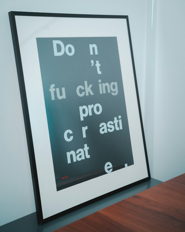
Good design is not always about adding more. Sometimes, leaving space around your content can make a design feel cleaner, easier to read, and more professional. This is called white space, and it is an important part of graphic design.
Why White Space in Graphic Design Matters
When I first started getting into graphic design, I thought an empty area meant something was missing. I wanted to fill the page with more text, images, or shapes. But I’ve learned that sometimes leaving things alone can make a design better. This is where white space in graphic design becomes important.
What Is White Space in Graphic Design?
White space is basically the empty space around the elements in a design. It can be the space between text, around an image, or between different sections of a layout. It does not have to be white. It can be any color or even part of an image. You can also explore different typefaces through Google Fonts when working on your designs.
For example, imagine a poster where everything is pushed close together. It can feel messy and hard to read. Adding more space between the elements can make the same poster feel much cleaner.
Final Thoughts on White Space in Graphic Design
Empty space in graphic design helps make a design easier to understand. When everything is close together, it can be difficult to know where to look first. Giving important elements more space can help create a clear visual hierarchy.
Negative space also works closely with typography in graphic design, helping text feel easier to read and giving the overall design a clearer structure.
It can also change the feeling of a design. A layout with lots of empty space can feel simple, modern, and calm. A design with less space can feel more energetic or busy.
I’ve noticed this in my own projects too. Sometimes when a layout feels empty, my first thought is to add another element. But after moving things around or increasing the spacing, the design can look better without adding anything.
Finding the Right Balance With White Space
Using white space does not mean making everything as spread out as possible. Too much space can make a design feel disconnected. The goal is to find a balance between the elements.
Next time your design feels crowded, try moving things apart before adding something new. You might find that the problem was not that your design needed more content. It just needed more space. White space in graphic design may seem simple, but it can make a big difference in how a design looks and feels. Try experimenting with it in your next poster, website, or social media post and see what changes.